The Equipment List
We started with feedback from users and key stakeholders:
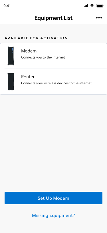
- The header “Equipment List” may not prepare users for a multi-step flow
- From a user during moderated testing: “I thought this was a static page, so I wasn’t prepared for steps to come after ‘Set Up Modem’… I thought it would automatically start setting up”
- The eyebrow copy wasn’t as clear as it could be
- Our initial discovery notes: “If the back end is hiding set up equipment, do we need eyebrows to bucket information? We’re currently only supporting one bucket”
- We brought this to stakeholders, and most of them agreed. The styling wasn’t reflecting the experience correctly.
- From a user during moderated testing: “I know what available for activation means, but it feels… complicated. I’m not sure if I have to do anything with my equipment right now. At first glance, it’s just available in the app.”
- Stakeholders had also brought up the concern that the language may be complicated.
- Our initial discovery notes: “If the back end is hiding set up equipment, do we need eyebrows to bucket information? We’re currently only supporting one bucket”
- The buttons are stuck to the bottom of the app.
- From a user during a phone call with customer service: “I don’t see how to move forward.”
- While buttons at the bottom of the page are commonplace, Spectrum designs for a much less tech savvy user base, so it was important for us to recognize our design system wasn’t serving all of our users.
- The overall UI felt dull and colorless.
- During an unmoderated test, a user called the design “boring and bland.”
We implemented changes to address the concerns we heard:
- The header “Equipment List”
- While this hadn’t served all of our users, our development partners were busy helping us update our design system. Stakeholders chose to keep “Equipment List” as part of the MVP launch.
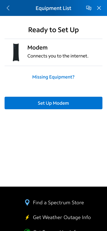
- The eyebrow text was replaced with title text.
- The buttons are no longer stuck to the bottom of the app, instead moving up the page to be more visible to the majority of users that had fewer than 3 items to set up on this page.
- Updated this page to better reflect a design system that was more colorful and engaging to users.
Released a post MVP follow up:
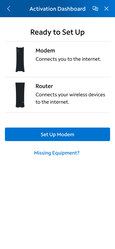
- Updated “Equipment List” to Activation Dashboard
- Post launch unmoderated testing found that over 70% of users were more prepared for a multi-step flow when dashboard was used in the header.
