
At a glance, the user now knows where their service is being moved, when their service is ending in their current location and starting at the new location, what equipment is coming to their new location, and what equipment has to be returned.
This is a final screen, so all of this information should be familiar to the customer and should be easy to scan when their move gets closer. Any information that was previously disclosed, but may not be necessary to reiterate to all users (like the return options), has been put into an easily accessible modal for users who may need to review it.
Breaking the Information Architecture Down
Return Options
The page starts with an alert to the user because if they read nothing else, this is the information they absolutely need moving forward. Unreturned products cost customers money, and we want to make sure that information is easily accessible, easily visible, and unquestionable. You may notice the return info is on the page twice. This serves a few purposes. First, the banner gives more color affordance. The design system this is built on does not use much color, using the yellow caution alert, the users’ eyes are more primed to see the information. Second, by using the banner alert, I was able to ensure the link out to “View Return Options” was clear. Lower on the page, the link is just underlined text, which may be missed. Third, by duplicating the information, we’re able to hopefully catch some people who skipped the banner (and catch people who skip the body of the confirmation page), and ensure users who see both are aware that this is important for them to internalize. Finally, the alert was the preferred solution of our stakeholders, but our email system could only print the body of the confirmation page. By keeping it in both places, we ensured the return info got emailed to all users because there could be up to 60 days between placing the order and needing to return equipment.
Order Submitted
If the user gets nothing else from this page, they need to know it’s a confirmation. With a green check and the standardized “order submitted” copy, the page is unambiguous at a glance. The body copy tells a user how to successfully complete the move. It was pulled to the top since it’s a preview of next steps that the user will later see in an email after the current service end date passes, so it could be skipped, and it wasn’t part of the move order receipt.
From this point on, the user saw this information on the review screen that came directly before the confirmation screen above.
UI and IA decisions will reference the Review & Confirm Screen instead
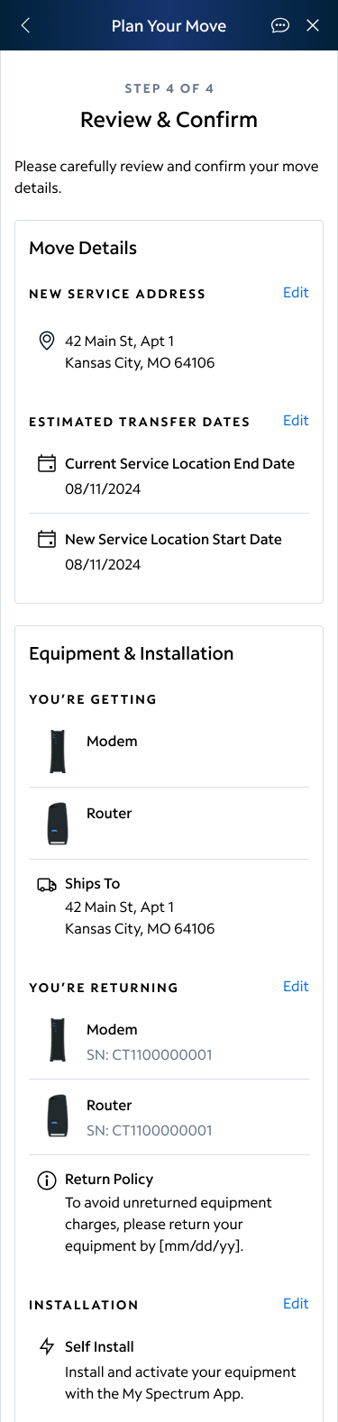
Move Details
Placed in a separate card to visually separate it from the other information on the page, move details covered the information the user completed in step one of the flow that leads to this screen. It’s confirmation of the address and dates without any service or installation info. It comes first not only because it’s the first information in the flow, but also because this is the information that is the most important for us to get correct. All other information can be changed easily online, but the move details are less easy to update, so it was prioritized on the page with visual separation. There was also an effort to ensure the move details was set up so that most devices will see the content in its entirety without scrolling, and the information was able to be scanned with reliance on text styles to bucket ideas and no long text blocks.
Equipment & Installation
Visually, equipment and installation was bucketed together on one card. Though this covers three pieces of information (shipping, returns, and installation), the flexible nature of the copy in the return policy information meant returns were considered both equipment and part of the installation which is why these are bucketed together. Return types vary by the type of installation being done. Keeping headers conversational, the user needs to know what they’re getting (if anything), what they’re returning (if anything) and the return policy, and how their new equipment is being set up.
Eventually, the user will be able to change their service type, which would make a new visual bucket between Move Details and Equipment & Installation, but that was not in the scope of these designs. It would come before equipment because the service type dictates the equipment given to a customer, but its still able to be changed after an order is placed which is why it does not supersede the move details.
