The page alert:
This covered an edge case where it could take longer than expected for a subscription to be available after purchase. Originally not accounted for since it was an edge case, it became the secondary focus of some unmoderated testing run in Q1 of 2025. All test users encountered a delay when accessing the subscription needed for the test, which is why it became the secondary focus–every user in the test brought it up. That user test found that 75% of users felt concerned that their subscription was not immediately available. This reasonable frustration needed a temporary content solution while the back end was updated.
The temporary solution proposed? A notification to help the user understand what is happening and where to get more info.
The majority of concerned users indicated they would call in if the subscription did not work immediately when the page did not acknowledge the delay. Adding a notification at the top of the page made users trust the experience more, with a second round of moderated testing showing that no users in the six person study would still be interested in calling for more information.
The exploration:

At first glance, this is a lot of exploration, but this covers three main points that eventually became proposals.
- Type of alert.
- A success alert: a green, positive alert with a check mark icon. In all cases, this alert would show immediately after purchase, so this solution emphasized the fact that the purchase was confirmed, which the user could see as a positive interaction.
- A caution alert: a yellow, warning alert with an exclamation point in a triangle. This wasn’t an error, and didn’t require action from the user, so a red error alert didn’t make sense, but the user could still see this as something not working quite right. Due to the placement of this message, and the fact it was a temporary solution, there were some edge cases where more than one page level alert could show. The yellow made sure it stood out from other alerts that surfaced on the page.
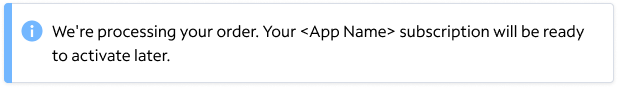
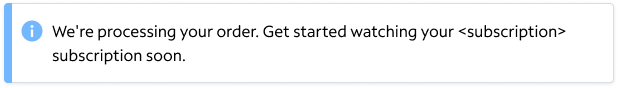
- An informational alert: a blue, informational alert with a circular icon. This approach ended up being the final stylistic choice for all of the proposals since 1. nothing had gone wrong, 2. nothing could be fixed, 3. the user is being given information first and foremost.
- An alert with a button. This was scrapped early on due to the nature of the back end limitation, but some thought was put in to having a button so users could immediately try again to see if the API just needed to be hit again. This only solved the issue 2% of times identified by our data team, so the proposal was only brought onto the page.
- Tone and length of messaging. As identified above, most users were concerned, but with the knowledge that our users outside of the test environment were not frequently encountering this error, I focused on an array of tones to assuage user concerns while trying to keep the error shorter than three lines.
- Technical limitations. Since this was fixing a delay that was in production, not all technical limitations could be addressed, and during the initial exploration this screen is showing not all technical limitations had been identified, there was a variety of directions put on the page so that when the development partners came back with limitations, the designs were already 90% ready for approvals.
The five proposals:


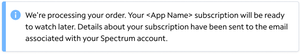
Why are these the five proposals that went to the product team and the relevant stakeholders? It was mostly to check the language. We were early on in the process of working with external apps, so I was still working with other content designers and stakeholders to align on how we referred to subscriptions names, how we talked about activating the subscription, and how often we acknowledged communications with the customer outside of the Spectrum experience. This alert was part of the round of approvals that solidified that the customer facing language focused on watching, not activating, that the emails could be referenced if there was no solution to an issue in the app or on the website at that moment, and that “order” was going to be used, until this point purchase versus order was a point of contention in this experience.
Technical limitations proved that “try again” wasn’t accurate enough for users. Some could reload the screen after 15 seconds, and the subscription would be linked, for others, it took up to 2 hours.
Tonally, while we typically avoid passive language, the emphasis was on which app was delayed, not the delay itself, which is why all of the proposals feature a to be verb.
The final alert:
Option 5 was picked with one piece of feedback, “watch later” wasn’t the tone stakeholders wanted to take. In order to make users feel more confident that the delay was not going to be intrusive, the final adjustment brought us to “Your <App Name> subscription will be ready to watch soon.”
 Colleen Rafferty